We are going to take you on two
journeys. First we are going to walk with you through Annandale House by Welsh
+ Major, taking you from the street, through the front door of the old cottage,
into the link, down into the new living space, and then through the garden to
the rear garage. We hope that as you come with us you will get some
understanding of why this building took out the top residential architectural
prize in NSW in 2017 and why it is an important structural engineering story.


Annandale House was not destined to
be an architectural masterpiece, but it became one through a truly
collaborative design process between architect and structural engineer. And
this is the second journey - we believe that, as structural engineers, our jobs
are not limited to just providing structural engineering advice. Our
contribution should start by understanding the architectural vision. Our
contribution should not only support this vision, but should enhance it. Our
contribution should also be about empowering the architect, giving them -
overloading them perhaps - information about the structure and the options
available so that they are able to intelligently contribute to the decisions
about the structure. We also believe this enhances a respect for the engineering
profession within an industry where respect is often lacking.

This building renovation started out
as a timber framed and plasterboard clad, two story extension. And the reason
this house started with this premise, along with most houses on a tight budget,
is because they are economical and easy to build. The building industry is
filled with conservative preconceptions about how the building structure should
be built. It is one of our jobs to question that; break it down and see where
the truth is. Annandale House now has no timber structure and almost no
cladding internally. This house underwent a radical rethink about what could be
done to achieve architectural and structural goals.
This house is not large. It is
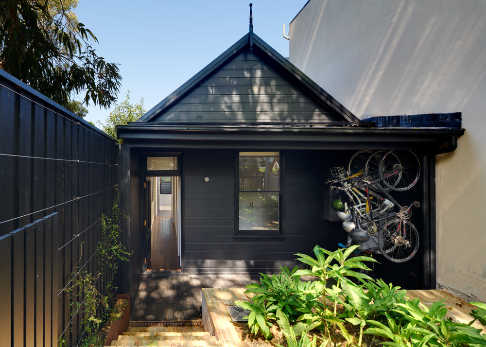
less than 200m2, and less than 5m wide. Annandale House is tiny and
innocuous as you enter off the street. The single story weatherboard cottage
that faces the street is untouched, only the timber cladding has been painted
dark grey. The footings were reinforced as they had failed, but otherwise the
structure was perfect, constructed of hardwood framing on brick walls built
directly off the bedrock. As you enter the front door and walk through the old
wooden floored corridor and past the first two rooms, you may start to wonder
where the award winning house has been hidden.
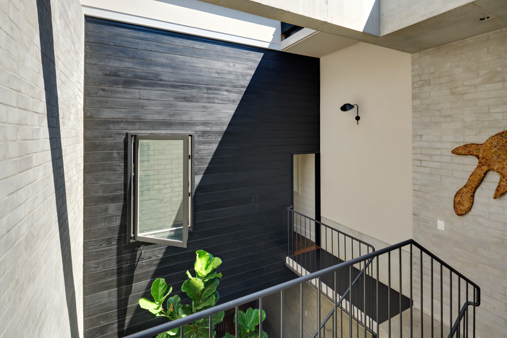
Continue along the corridor and at
the end you step out of the old cottage and into the new extension. Pause here
for a moment and let your eyes adjust to the natural light spilling through the
space. This is the point where you fully experience the full height of the two
story building. You are on a bridge with a large void to the right, leading via
an open stair, down to the lower level. And now that your eyes have adjusted,
look up through the void to the sky. Try to determine now if you are inside or
outside - in fact, you are in both – a large retractable skylight opens this
space to the outside. The light spills down into the lower levels and you are
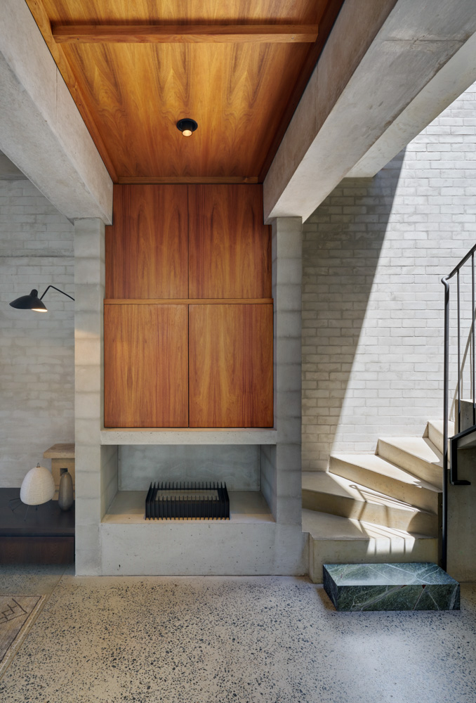
drawn down the light ribbon stairs. As you descend the stairs you see the
concrete extend all the way to the back of the house, to the concrete framing
over the rear door and right the way through to the end of the garden. Concrete
is the constant motif through this house.

David Welsh from Welsh + Major
Architects always had a vision of this open void space - a skylight within the
void, and this space being openable to the sky. What he did not imagine was the
structure and the cladding required to deal with the durability issues to make
this indoor/outdoor space work. Our first of many collective workshops focused
on the structural solution for this architectural space. We challenged the
presumed notion of timber framing and introduced the option of a concrete
structure. And it is this off-form exposed concrete that you now see when you
are in this space. You see the concrete bridge leading into the bedrooms, and
you see the concrete stair leading down to the lower level polished concrete
slab. Using concrete solved the main issue of durability with this
indoor/outdoor space. The concrete needed no external cladding to protect it,
and could easily be made durable for the external environment. There are other
advantages with using concrete but it also has consequences too. It was going
to be more expensive, and we would need to find a builder who could build it.
Off form concrete is not for the faint hearted. Being a natural material,
concrete lives its own life - you pour it in formwork and wait patiently for
the formwork to be removed to see what the concrete has become for you. It is a
personal experience and is often not what you expect. And that is its beauty.
The client must understand that process of revealing, embrace it, and accept
it.

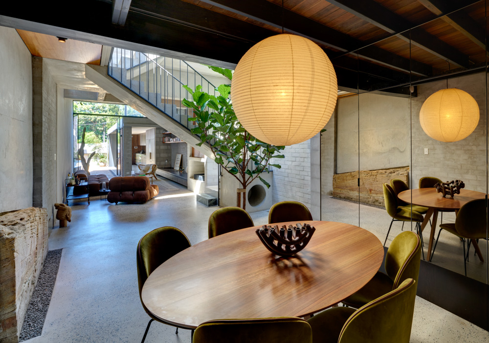
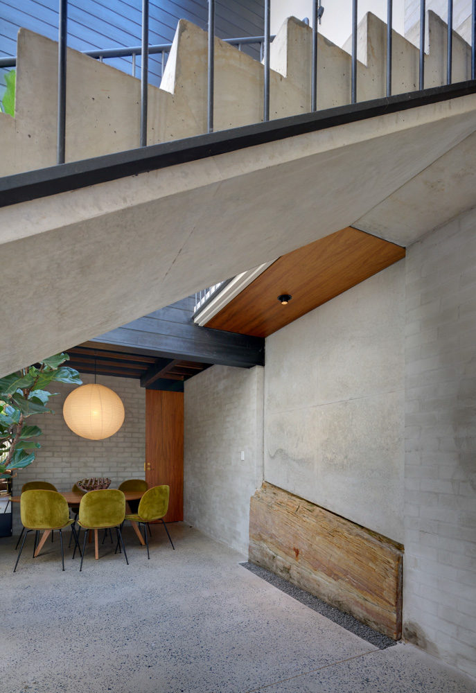
As we descend the stairs and approach
the bottom, the stairs take a 180 degree turn. At this point your view to the
back of the house and yard is blocked by a wall. It appears that this turn has
occurred to accommodate this wall. Curiously, in a lower section of this wall
is a small section of exposed bedrock. The architect has used this wall to
guide us into this space. It is a relaxing and calm space with a small trickle
of water running down the face of the expose rock and into a stainless steel
grate. In this area there is also a subterranean space underneath the front
timber cottage with a ceiling of the timber joists and floor boards of the old
timber cottage. Had we not turned 180 degrees we would have completely
missed these spaces. The walls at the bottom of the stair are used to define a
small living area and are lightly rendered blockwork where you can still see
the joints as dark lines. They tell you the story about what they are. These
walls are key structural elements. The original architectural concepts did not
have these walls protruding into the space.
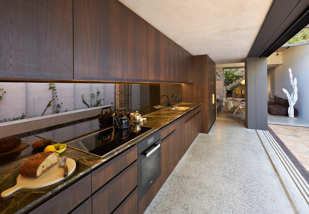
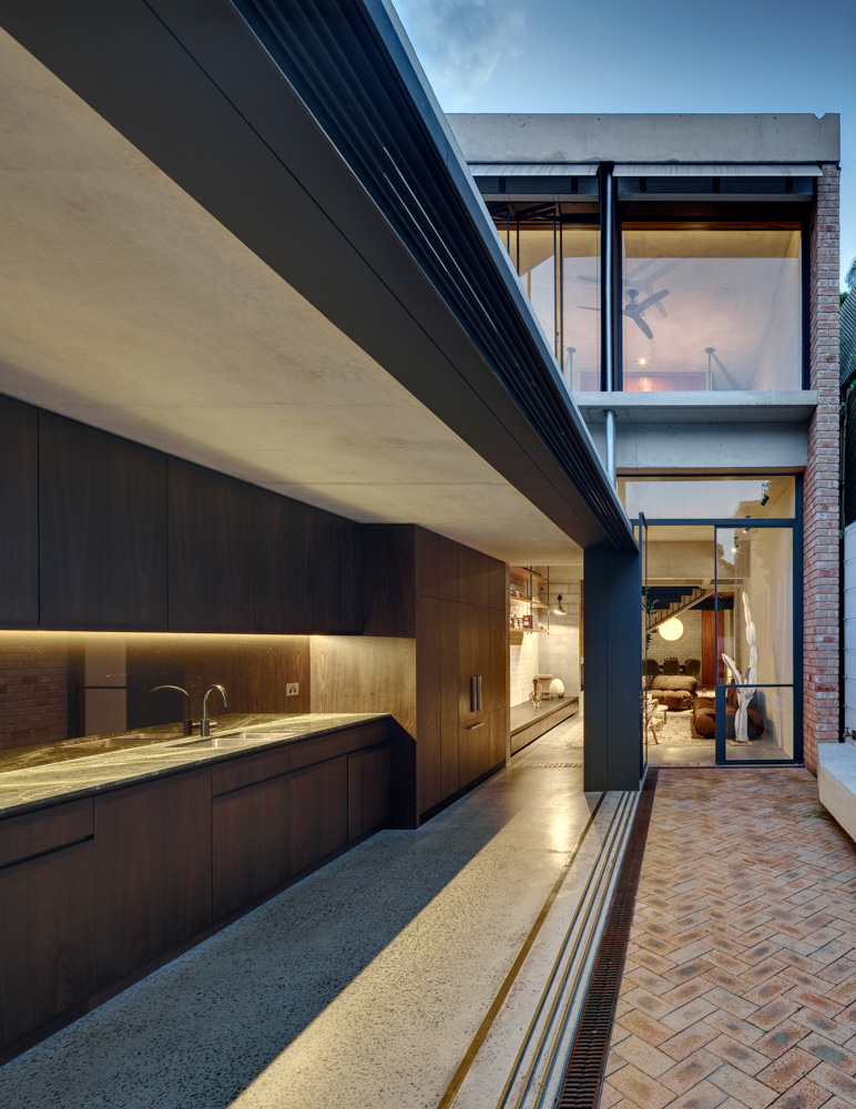
Passing through this small living area you enter into the unseasonably
cool galley kitchen. Above the kitchen is a garden roof, extending the entire
length of the kitchen. It is this garden, along with the mass of the concrete
slab it grows on, that helps to keep this space an almost constant temperature
all year round. The garden offers protection from the summer sun and insulation
from the winter cold. Although it is possible to construct these green roofs on
a light timber frame, it is far more durable to construct using concrete. The
thermal mass of the concrete also helps control temperature of the space. And
all the ceilings are off form concrete. These were all additional contributing
factor to the use of concrete.

The largest structural challenge with
these narrow sites is lateral stability. Without any return walls through the
site it is challenging to keep the building stable from lateral wind and
earthquake loads. Through another series of workshops with the architect we
discussed introducing steel portal frames, introducing large brick return
walls, and we even discussed concrete columns combined with concrete beams to
form a rigid concrete portal frame. Initially these were all dismissed by the
architect, particularly as the detailing of these were difficult and David
challenged us to think of other options. We never turn away from a challenge
and eventually formulated an alternative solution.
We proposed short heavily reinforced
block walls to provide stability. We were sympathetic to the fact that they
were going to disrupt the flow of the space and we proposed multiple locations
where they could be placed strategically to minimize impact. In all we gave the
architect more than 7 options on how to solve the lateral stability challenge.
In the end he chose the option of the nib walls and chose a location where the
walls could be used to enhance the architecture. We empowered him to make the
choice, take ownership, and he believed that blocking the view to the rear at
the base of the stair enhanced the architectural experience. When you face a
challenge the best thing to do is explore options, always question, always
explore, always explain. At Cantilever we have dozens of anecdotes where it is
this exploration that has led to extraordinary architecture.

It is probably appropriate now to
introduce you to the builder. If you are going to deviate from a conventional
timber framed building, and stick to a budget, by introducing off-form
concrete, you need to think about the builder. We have done dozens of buildings
with SFN Constructions. And when we explored the use of off-form concrete we
thought it was important to recommend that they contribute to the design and
offer some cost guidance. We introduced the architect to SFN
very early on in the design process – even before off form concrete was the
firm choice for the build. SFN met with us and discussed the project and they,
from time to time during the design phase, contributed to the project. We
believe this project would not have been a success without their early
involvement.

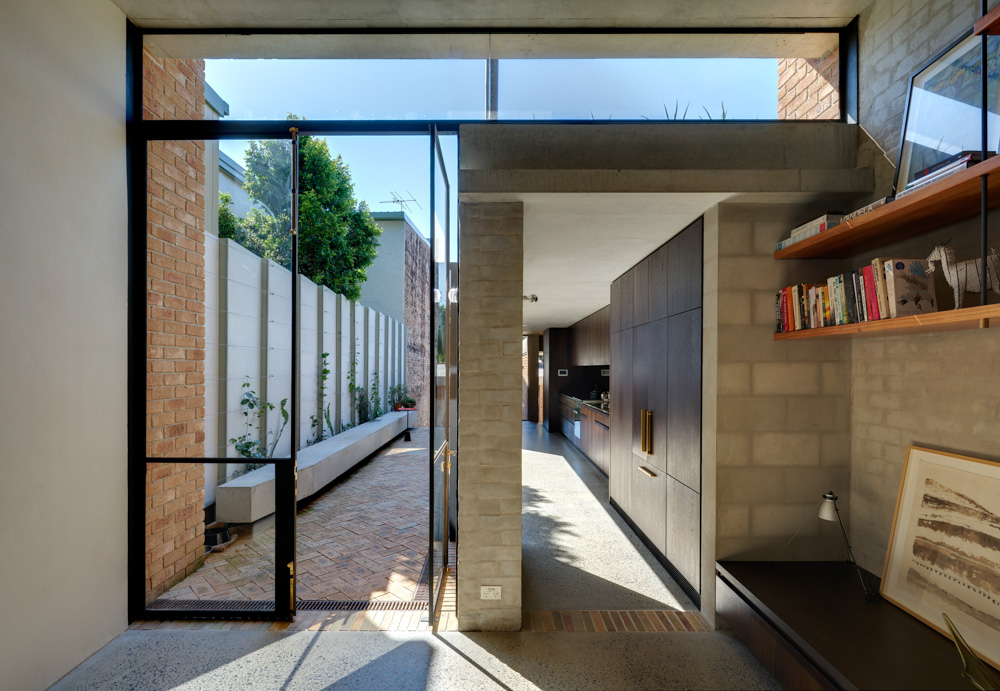
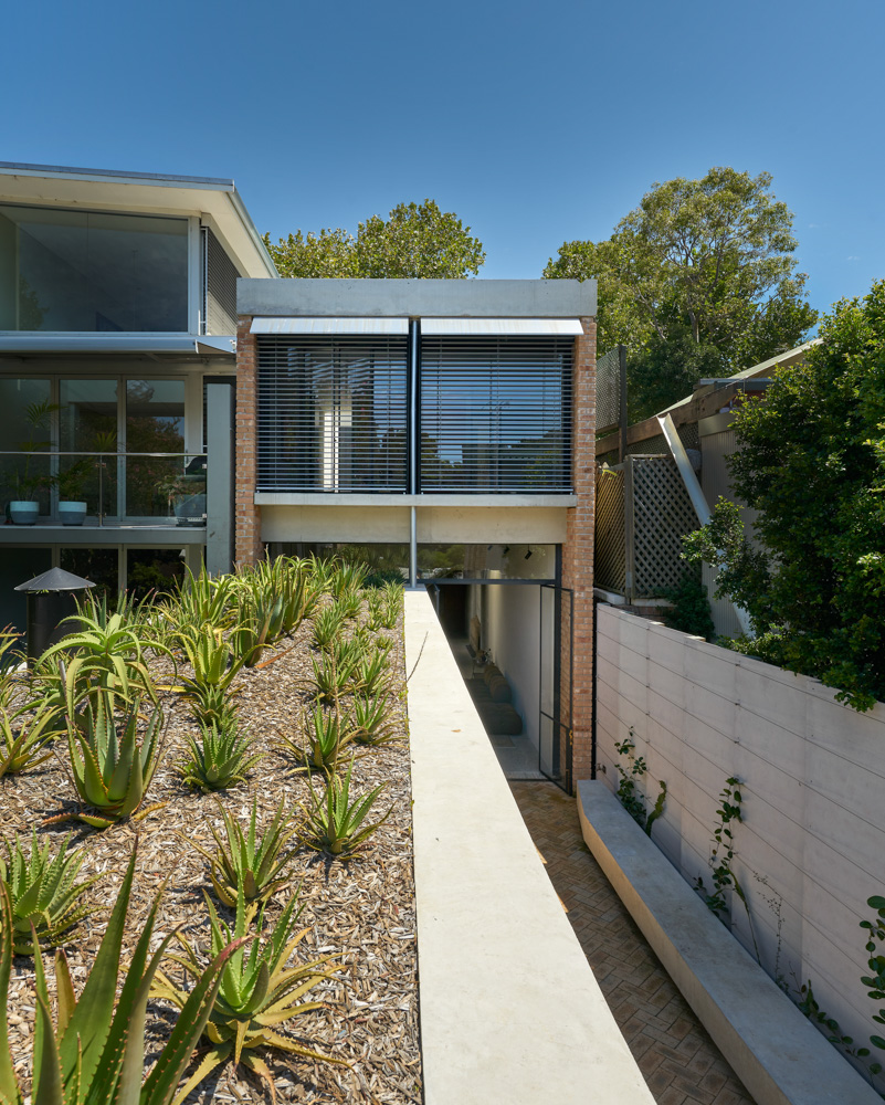
As you stand in the cool summer
kitchen your gaze will eventually be drawn out through the large sliding doors
to the long floating concrete bench in the rear yard. It is difficult to see
the small steel brackets supporting the bench, but it was desirable to make
these supports invisible. We analyzed the bench and the brackets using finite
element software, Strand7. Perhaps bizarrely, this was the only element of the
building done using this sophisticated structural engineering package. It took
two days to analyze and document these tiny supports and the concrete bench.
Like a perfectly composed photograph this bench has long leading lines which
draw you out of the kitchen, into the yard, onto the brick checkerboard
patterned paving, down the brick stairs and right to the door at the rear of
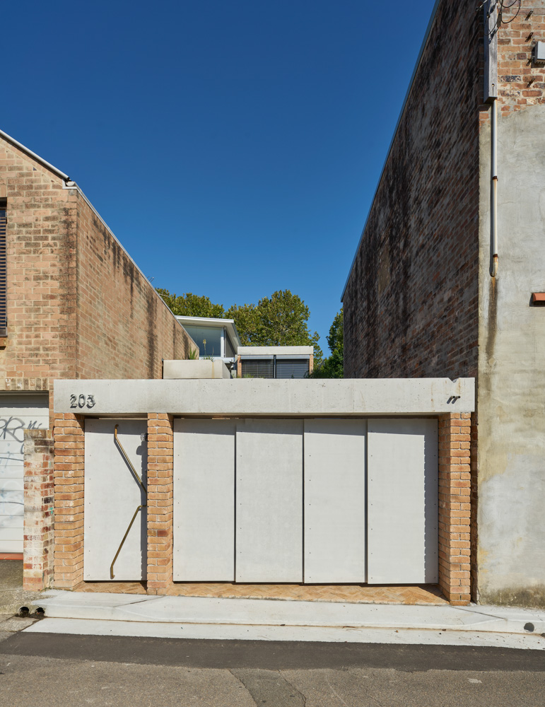
the site. Even as you stand in front of the rear garage door you are looking at
the structural theme that cements the entire build together: off form
concrete.

Although we have said that it was our
collaborative approach that made this house a success there is a key aspect
that we need to reflect on here. Collaboration only works when all parties are
open and humble, devoid of ego. It is when everyone listens with respect
and ideas discussed openly and without fear that collaboration can occur. There
is an additional idea at play here which makes this house a success. It
is the harmony between the structure and the architect. At no point do
you see these two elements fighting each other. Nothing seems
forced. Utilitarian expressed structure compliments and enhances the
architecture. The structure becomes ornament. As structural engineers,
this is our number one priority.
Project Team
Structural Engineer: Cantilever
Consulting Engineers
